Statistics with python#
Descriptive stats: Summary stats with python (mean, std, sem, CI, median, percentiles, IQR), statistical plots (hist, boxplot, violin)
Inferential stats: Hypothesis testing (parametric/nonparametric, paired/unpaired, two-sided/one-sided, Anova)
scipy.stats and numpy cover the basics. For more complex stats use the python package statsmodels or the R-language.
import numpy as np
import scipy
import matplotlib.pyplot as plt

plt.style.use('ncb.mplstyle')
Probability distributions#
Experimental measurements help to draw general conclusions and to derive rules from the investigated interactions of parameters and measured features: One parameter is varied (e.g. an electrical current stimulus on a neuron), while the resulting effect on a feature is measured (e.g. the firing rate of a neuron).
This would be rather simple if the measured feature would always be the same for a given parameter change. However, in reality this is not the case: Measurements are variable, because even under controlled experimental conditions, one can never control ALL factors that might influence the result. For example, in a behavioral animal experiment, the animal might show different reactions due to being sick, tired or hungry, independently of a well-controlled task. Even if there is a clear dependence between the varied parameters and the measured feature, the feature values willl aways be scattered around the expected value.
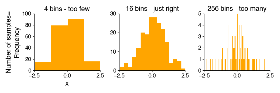
Visualizing the frequency distribution of your data using histograms#
The frequency distribution describes how often a measured value occurs and serves to estimate the probability of that measured value. We estimate the frequency distribition using a histograms, which can be used to derive the underlying probability density function.
Histograms show how many of the measured feature values occurred in defined, contiguous ranges (contiguous means that there is no gap between ranges). Each of those ranges (also called “bins”) is represented graphically by a rectangle (or bar). The bar’s height represents the measured frequency (number of samples falling into each bin). The choice of the number and borders of the bins depends on the data, the sample size, and the scientific question. More samples allow more bins and more details. If too many bins are used for a given sample size, some of the bins will by chance be empty, making it difficult to judge the shape of the frequency distribution.
Probability density function#
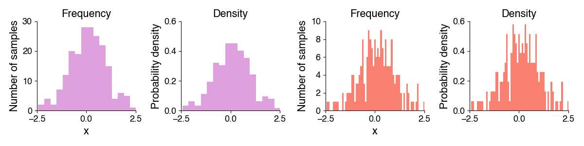
In contrast to the frequency distribution, which contains the number of values in each bin, the probability density function indicates probabilities for the occurrence of specific feature values. For continuous numerical data, you could imagine scaling a histogram to relative rather than absolute numbers of occurrences, so that the area under the histogram is 1.0. The height of the bars then corresponds to the fraction of the data points falling into each bin and is independent of the sample size.
Histograms in python#
In python, we can plot a histogram using plt.hist:
n, bins, patches = plt.hist(x, bins, density) (docs)
Arguments:
x: your data as a list or numpy arraybins: Optional. Number of bins or position of bin edges (defaults to 10 bins with the bin edges chosen based on the data).bins=32will make a histogram with 32 automatically placed bins,bins=np.arange(0, 5)=[0, 1, 2, 3, 4]will make a histogram with 4 bins with the left edge of the first bin at 0 and the right edge of the last bin at 4.density: Optional. If False (default), the height of histogram bars corresponds to the number of samples falling into each bin (frequency). If True, the bar height corresponds to the probability density.
Returns:
n: histogram value for eachbins: bin edges for the histogrampatches: handles to the graphical elements representing the histogram bars for manipulating the plot
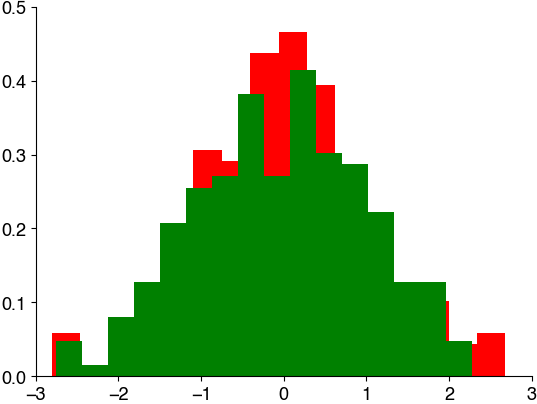
Let’s draw some random numbers and illustrate the different ways of generating a histogram:
import numpy as np
import matplotlib.pyplot as plt
x = np.random.randn((200))  # generate 200 random numbers with standard normal distribion (mean 0, std 1)
y = np.random.randn((200))  # generate 200 random numbers with standard normal distribion (mean 0, std 1)
x

plt.hist(x, bins=16, density=True, color='r')
plt.hist(y, bins=16, density=True, color='g')
(array([0.04775241, 0.01591747, 0.07958735, 0.12733977, 0.20692712,
        0.25467953, 0.270597  , 0.3820193 , 0.270597  , 0.41385424,
        0.30243194, 0.28651447, 0.22284459, 0.12733977, 0.12733977,
        0.04775241]),
 array([-2.74886895, -2.43474869, -2.12062843, -1.80650817, -1.49238791,
        -1.17826765, -0.86414739, -0.55002713, -0.23590688,  0.07821338,
         0.39233364,  0.7064539 ,  1.02057416,  1.33469442,  1.64881468,
         1.96293494,  2.27705519]),
 <BarContainer object of 16 artists>)
Mini-Exercise#
You are given 10k samples from a probablility distribution
Visualize the data using a histogram with:
no specification of the bin number and position
3 bins
32 bins
64 bins between 0 and 2
x = np.random.weibull(2, (10_000))  # generate 10k random numbers from a probability distribution

# your solution here
Normal distribution#
The normal or Gaussian distribution has a symmetrical, bell-like shape, with most data close to the mean and fewer values far away form the mean. They are fully described by their mean and standard deviation (std). Thus, if you know that something is normally distributed, all you need to (and can) know about your data are just these two numbers - mean and std. That’s pretty neat!
This is the formula of the probability density function (PDF) of a Normal distribution: \(f(x | \mu, \sigma^2) = \frac{1}{\sigma \sqrt{2\pi}} e^{-\frac{(x - \mu)^2}{2\sigma^2}}\)
\(f(x | \mu, \sigma^2)\): The probability density function of the normal distribution with mean \(\mu\) and variance \(\sigma^2\), evaluated at a specific value x.
\(\mu\) (mu): The mean (average) of the normal distribution, which represents its central location.
\(\sigma\) (sigma): The standard deviation of the normal distribution, which represents its spread or dispersion.
This formula describes the shape of the normal distribution’s probability density function, which is a symmetric, bell-shaped curve centered at the mean \(\mu\), with the spread determined by the standard deviation \(\sigma\).
Generating random numbers in python#
Using python, we can easily generate random numbers with a specified distribution:
uniform:
np.random.random_sample(size=(100,))draws samples from uniform distribution with bounds [0, 1) (0 is inclusive, 1 is not: \(0\geq x<1\)).random integers:
np.random.randint(low=4, high=10, size=(1,))draws integers from a uniform distribution [low, high) (0 is inclusive, 1 is not: \(0\geq x<1\)).normal:
np.random.standard_normal(size)draws samples from standard normal distribution with mean 0 and std 1.random order:
np.random.permutation(list)
We will make use of this to illustrate a couple of concepts in statistics.
To get reproducible random numbers (everytime the same numbers), you can call np.random.seed(seed). seed is an arbitrary integer and fixes the state of python’s random number generator.
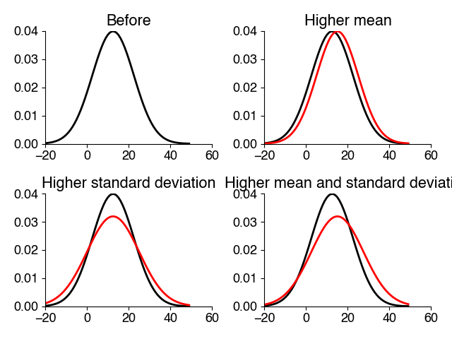
Mini exercise#
Generate 1000 numbers drawn from a standard normal distribution (mean 0, std 1). Visualize the probability density using a histogram.
Manipulate the same samples to change the mean to 1 and visualize the resulting density.
Manipulate the same samples to change the standard deviation to 2 and visualize the resulting density.
# your solution here
Empirical mean and standard deviation#
When we define a probability distribution, for instance a Normal distribution, we can specify it’s mean and standard deviation - these values are also called the theoretical mean and standard deviation.
But for a dataset with samples \(x_1, x_2, \ldots, x_n\) we do not know the mean and standard deviation of the underlying probability density function.
However, we can calculate the empirical mean and standard deviation of any distribution (not just a Normal one) using the following formulas:
The empirical mean (often denoted as \(\bar{x}\)) is calculated as: \(\bar{x} = \frac{1}{n} \sum_{i=1}^{n} x_i\)
\(\bar{x}\) represents the empirical mean or average.
\(n\) is the number of data points in the dataset.
\(x_i\) represents individual data points in the dataset, indexed from 1 to \(n\).
\(\sum_{i=1}^{n}\) denotes summation, indicating that you should sum all the data points.
The empirical standard deviation (often denoted as \(s\)) is calculated as: \(s = \sqrt{\frac{1}{n-1} \sum_{i=1}^{n} (x_i - \bar{x})^2}\)
\(s\) represents the empirical standard deviation.
\(n\) is the number of data points in the dataset.
\(\bar{x}\) is the empirical mean or average (calculated as shown above).
\(x_i\) represents individual data points in the dataset, indexed from 1 to \(n\).
\(\sum_{i=1}^{n}\) denotes summation, indicating that you should sum all the squared differences between each data point and the mean.
Effect of sample size#
How close the empirical mean and standard deviation are to their true values depends on the sample size: The larger the sample size, the closer (more accurate) your estimates will be to the true values. With few samples, random outliers will strongly influence and distort the estimates.
This is captured by the law of large numbers: It states that with increasing sample size \(N\), the empirical mean (the average of the samples) tends towards the theoretical mean (the true mean of the underlying distribution). In other words: The more samples, the more the frequency of an observed event approaches the actual probability of occurrence (the probability that is theoretically expected based on the underlying probability distribution).
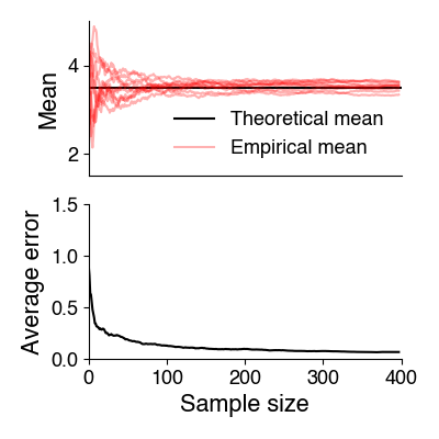
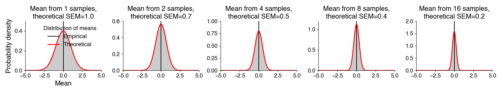
Standard error of the mean#
The standard error of the mean measures how well the available sample size allows to estimate the true mean of the underlying distribution. The idea of this measure is the following: Imagine you draw N samples from the entire population and you calculate the empirical mean from the samples. That empirical mean will be different for different sets of N samples, depending on which individuals you measured (e.g. in one sample are a couple of very large individuals, and in another sample some particularly small individuals). The standard error of the mean measures how much the empirical means from different sets of samples of the same size will scatter.
The standard error of the mean (SEM) is defined as: \(\sigma_{\bar{x}} = \sigma / \sqrt{N}\)
\(\sigma\): The theoretical standard deviation (the std of the underlying probability distribution) - the more variable the underlying distribution, the less certain the mean will be.
\(N\): size of samples. Since \(N\) is in the denominator, the SEM shrinks with sample size. But, because of the square root, not linearly but with “diminishing returns” - doubling the sample size does not half the SEM.
Note that \(N\) is not always the number of samples. Sample size corresponds roughly to the number of independent samples - if you measure the blood pressure in 10 mice, 10 times in a row, then you will have 100 samples but they are not all independent.
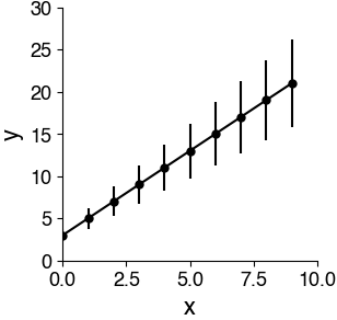
Plots with error bars#
Plots with error bars can be generated using plt.errorbar(x, y, yerr) (docs).
yerr can be anything but is typically either the standard error of the mean (SEM) or the standard deviation. These two measures mean fundamentally different things:
SEM: How confident you should be about the plotted mean. This can be useful for comparing means. It decreases with sample size.
STD: How widely distributed your data is. This tells you something about the data distribution and is independent of sample size.
If you see a plot with error bars, always check what they mean. And think carefully about what measure you want to choose when plotting error bars yourself.
# generate toy data
x = np.arange(0, 10)
y = 2 * x + 3
yerr = y / 4

# make a plot with error bars
plt.figure(figsize=(3, 3))
plt.errorbar(x, y, yerr, c='k', fmt='o-')
plt.xlabel('x')
plt.ylabel('y')
plt.show()